South Asian American
Digital Archive
Building a collective memory

Context
Building a
collective memory
The South Asian American Digital Archive preserves histories often absent from the public record. Its online collections bring material held by families and institutions into public reach, alongside accounts contributed by community members. As SAADA grew, its design needs stretched from a recognizable identity to the details of finding a document or reading a personal history. The work with its Executive Director connected those needs across the website and, later, print.
Identity & interface
Balancing systems and stories
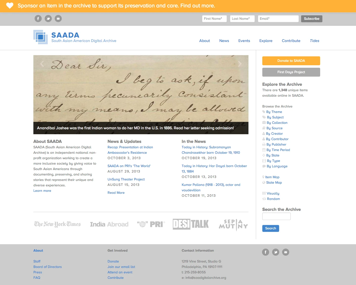
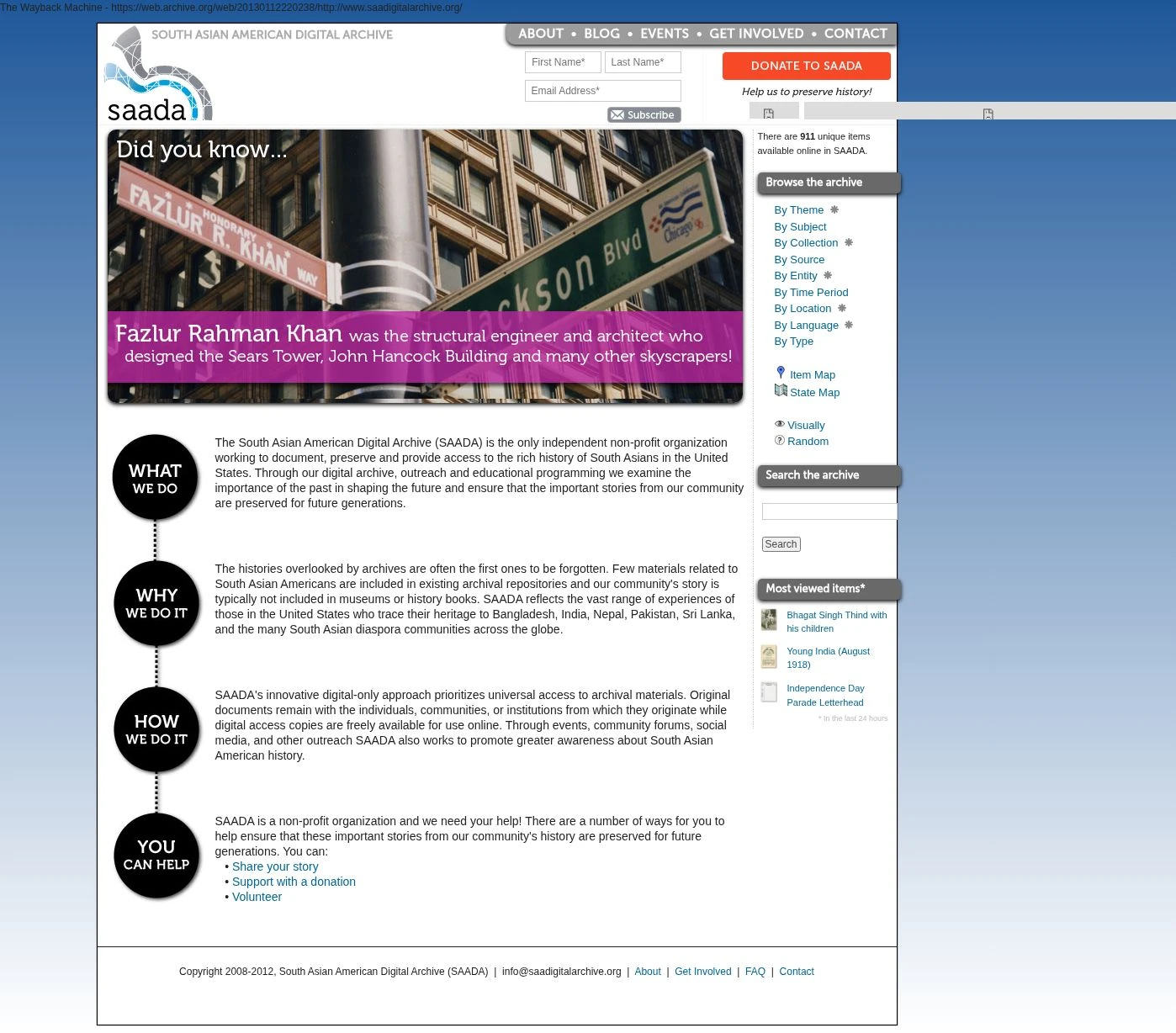
The interface needed to accommodate deliberate research and the curiosity that begins with a photograph. Image-led pages gave visitors an entry point; browsing options provided routes further into the collection. The identity work called for continuity, preserving recognition as the organization developed. With roughly a third of early traffic coming from mobile devices, responsive design became a practical priority.
The First Days Project brought the relationship between structure and content into sharper focus. Each account described an arrival in the United States. A map supplied geographic context, but its scale competed with the story. Narrowing it gave the narrative more room, with layouts adapted to the medium. Clearer navigation and visible contribution prompts helped connect reading with participation. The team adopted specific navigation and styling recommendations.
Interface / detail
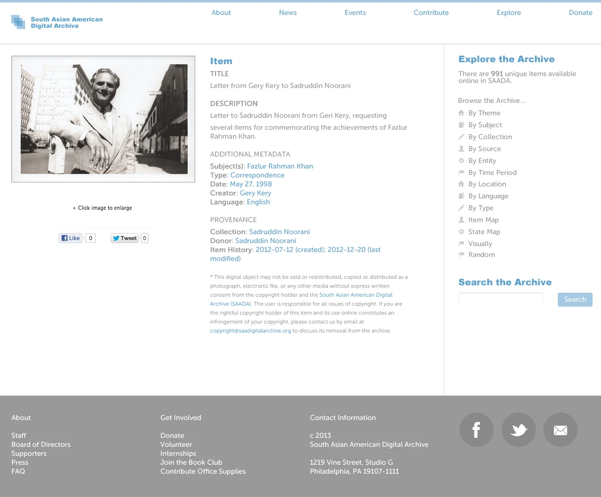
Item-detail mockup. The archival image sits alongside descriptive metadata, with search and browse controls kept within reach.
Homepage / before & after
Editorial design
On the page
Our Stories brought the archive into print. An eleven-column grid left one column clear toward the spine, giving the text a comfortable measure while allowing photographs to extend wider. Separate typography distinguished insets from the main account, so readers could follow a thread or pause for context.
The template changed with the available trim sizes. Photographs were prepared individually for black-and-white printing; color originals remained available for the digital edition.
Tools & handoff
Continuing the work
The Educators’ Companion was delivered as an editable template, with sample sections the team could extend. Further website development included search and related-content components, accompanied by guidance for reviewing migrated content. That guidance covered image descriptions and editorial cleanup.
Collaboration: Executive Director and SAADA team; editor for book development. Final book layout and the companion website were handled by the layout designer and companion-site designer respectively.
Contact
Let's talk
Need a website that makes publishing easier for your team?